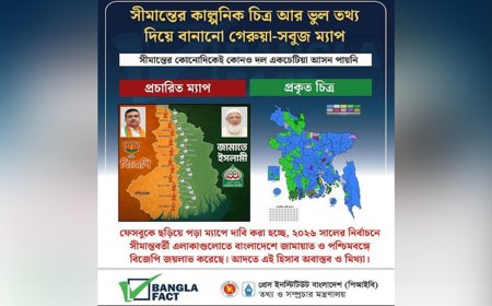
In the era of artificial intelligence, Google is refreshing the visual identity of its products with new gradient-designed icons for Photos and Maps, aiming to maintain a unified color and design consistency across its ecosystem, reports 9to5Google.
In May, Google introduced a gradient design to its Search app icon, replacing the previous four solid-color sections. A similar update was later applied to the Gemini logo. In September, the company announced, “While retaining Google’s traditional four colors, brighter tones and gradients have been used to symbolize AI-driven innovation and creative energy.”
The new Maps icon retains its familiar pin shape but now appears slimmer and more modern, with an enlarged inner circle and the removal of the previous diagonal blue division. The Photos icon, meanwhile, keeps its signature pinwheel design, but the gradient effect now radiates outward from the center, making it appear cleaner at smaller sizes.
Although Google has not yet announced an official release date for the updated icons, the company stated that they will be rolled out soon in alignment with upcoming AI-powered features such as Gemini-powered Ask Photos, Remix, Video Generation, and conversational editing.
DBTech/BMT/OR