


Google Gradually Introduces Gradient: Subtle Logo Redesign Spotted on Mobile Apps


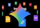
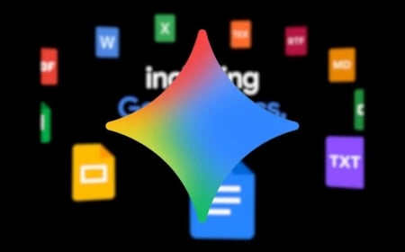
Google has subtly updated its app logo with a new gradient design, recently noticed by Android and iOS users, according to Engadget.
Previously, the logo featured four solid-colored segments, but now displays a smoother, blended gradient between the colors. However, the favicon on browsers and official Google press images still show the older, solid-color block version.
No changes have been observed yet in the logos of Google’s other apps. Nonetheless, a faint gradient in the star symbol of the Gemini AI assistant may suggest further design changes in the pipeline.
What makes the update particularly notable is that it has been rolled out without any formal announcement. This stands in contrast to the company’s widely publicized logo change in 2015. The quiet and fragmented introduction of the new design has caught many users by surprise.